Your First Windows WPF App with Elements
Elements integrates with the Visual Studio project template system to provide you with skeleton projects to get started with a new app.
This tutorial will cover all languages. For code snippets, and for any screenshots that are language-specific, you can choose which language to see in the top right corner. Your choice will persist throughout the article and the website, though you can of course switch back and forth at any time.
To start with a new project, simply select "File|New|Project..." from the main menu, or press ^⇧N. If you have the Start Page showing, you can also select "New Project..." near the top left corner.
This will bring up the New Project dialog. Depending on what edition(s) of Elements you have installed, you will have templates for one or all Elements languages: Oxygene, C#, Swift, Java, Go and Mercury. Depending on your edition of Visual Studio, it might also offer templates for other, Microsoft-provided languages:
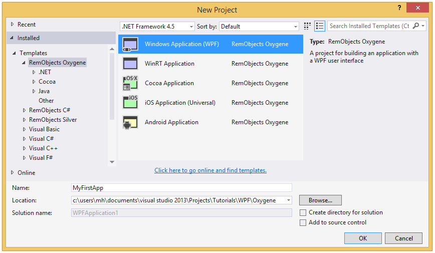
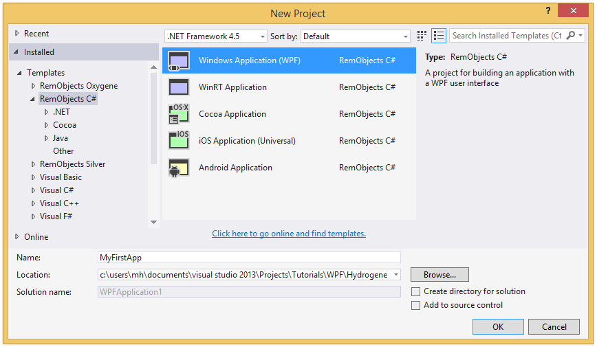
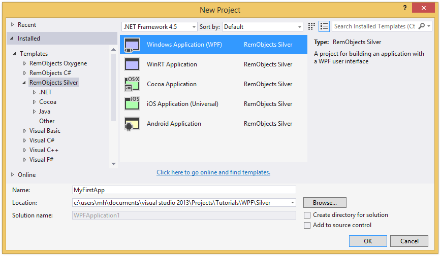
Select your language of choice, and then find the "Windows WPF Application" project template under Windows category.
On the next step you can choose a name for your application, as well as a location on disk where you want to store it. For this tutorial, name the project "MyFirstApp" and then click "Create".
Your project will be created and open in the IDE within a few seconds. Visual Studio should now look something like this:


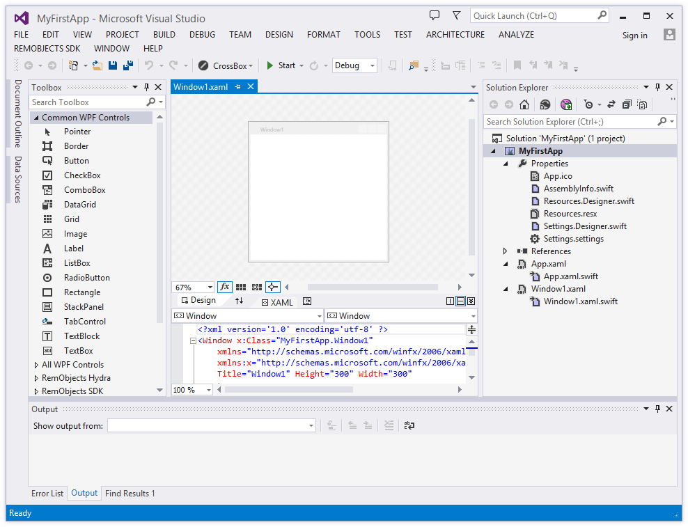
Let's have a look around this window, as there are a lot of things to see, and this is the main view of Visual Studio where you will do most of your work.
The Visual Studio Main Window
On the right side, you see the Solution Explorer. The Solution Explorer is one of several panes that can be docked to this side, and it will show you a hierarchical view of your project.
Elements works with projects inside of a Solution (hence the name). You can think of a Solution as a container for one or more related projects. Visual Studio will always open a solution, not a project – even if that solution might only contain a single project, like in this case.
You can close Solution Explorer to get it out of the way (for example on small screens), and you can always bring it back via the "View|Solution Explorer" main menu item.
The Solution/Project Tree
The Project Tree shows you a full view of everything in your project (or projects). Underneath the root node for the solution, each project starts with the project node itself, with the square Elements Project logo as icon. The icon is color-coded by platform (blue for .NET, green for Cocoa and yellow for Java), as will be the source code files.
Each project has two special nodes, along with any additional files in the project.
-
References lists all the external frameworks and libraries your project uses. As you can see in the screenshot, the project already references all the most crucial libraries by default (we'll have a look at these later), and you can always add more by right-clicking the References node and choosing "Add Reference..." from the context menu. Please refer to the References topic for more in-depth coverage.
-
Properties is a regular folder that can (and does) contain files, but it also gives you access to all the project settings and options for the project, which pen in a new tab when you double-click the node. The project settings are covered in great detail here.
-
In addition, your project will contain one or more (usually more) other files, both source code and other types, that make up your application. These files may be on the top level next to References and Properties, or nested in additional subfolders.
The Main View
The bulk of the Visual Studio window is filled with the file(s) you work in, showing in different tabs across the top. As you select files in Solution Explorer, they will show as a temporary tab on the right. You can double-click files in Solution Explorer to open them in tabs that stick around longer, and show on the left, as in the screenshot above.
You can navigate between files both via any open tabs at the top, or by Solution Explorer.
Your First WPF Project
Let's have a look at what's in the project that was generated for you from the template. This is already a fully working app that you could build and launch now – it wouldn't do much, but all the basic code and infrastructure is there.
There are two pairs of files here that are interesting, the App.xaml and the Window1.xaml, both of which have a code file of the same name nested underneath them.
There's also a Properties folder, which we won't go into for this text, but which is covered in more detail in the Your First .NET Command Line App tutorial. The contents in this folder are pretty much identical for all .NET projects.
App.xaml
App.xaml and its code counterpart implement a descendant of the System.Windows.Application class, and is sort of the central anchor point for your application, comparable to the Application Delegate on Cocoa.
It provides several events that you can implement handlers for to be informed about actions happening during the application lifecycle, for example the Startup event. It also defines what the first view of your app will be, via the StartupUri property, which points to Window.xaml by default.
You might also have noticed that your project has no main() function, no entry point where execution will start when the app launches. Among other things, the entry point will be generated by the App.xaml file.
<?xml version='1.0' encoding='utf-8' ?>
<Application x:Class="MyFirstApp.App"
    xmlns="http://schemas.microsoft.com/winfx/2006/xaml/presentation"
    xmlns:x="http://schemas.microsoft.com/winfx/2006/xaml"
    StartupUri="Window1.xaml">
  <Application.Resources>

  </Application.Resources>
</Application>
Window1.xaml
Window1.xaml and its code counterpart implement the main window for your app, descending from the System.Windows.Window class.
But first, let's take a look at XAML file pairs in general. The .xaml file is the main file of the pair, and it essentially contains an XML representation of a class tree – in case of a window not just the window itself, but also any controls that show on that window, as well as their properties. Different than in many other UI frameworks, controls can be nested within each other – for example a button can contain a label and an image, which are separate controls.
Behind the scene, the compiler toolchain will generate code from the .xaml that compiles into a new custom class – in case of Window1.xaml the implementation of your window class, called MyFirstApp.Window1. (You will sometimes see this code file mentioned, for example in error messages; it is called Window1.g.pas, where "g" stands for "generated".)
The second file, shown nested underneath the .xaml in Visual Studio, is a code file. It also declares a portion of that same class, leveraging a feature of the Elements compiler called Partial Classes. This file is where you put any of the code you will write yourself to finish the implementation of the Window1 class.
When your app gets build, the compiler will take both parts and treat them as one single class.
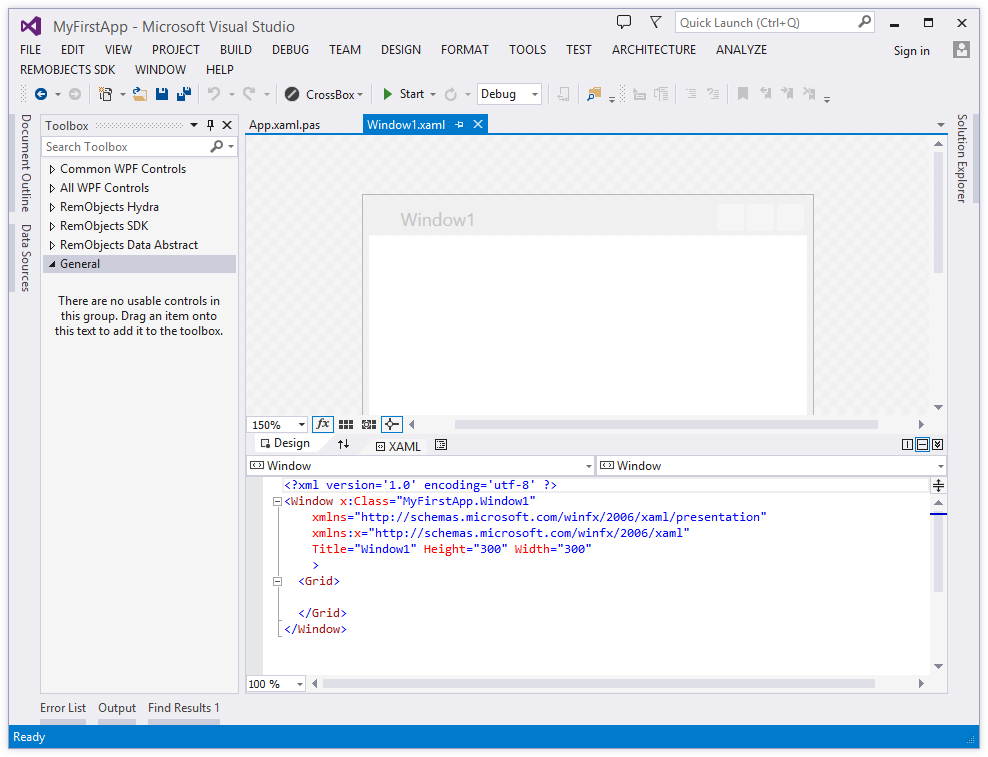
The Window1.xaml file can be edited in two views – in the Visual Designer (shown at the top) or as raw XML code (shown at the bottom). You can switch between the two or show them as split view via the "Design" and "XAML" buttons in the center of the screen:
Designing your User Interface
It's time to create some UI.
WPF uses layouts that define how controls get arranged on the form. The default template starts with a Grid layout, which creates a table-like structure of rows and columns across the window. We don't want that, so click into the middle of the form to select the (empty) grid and press Delete. You should see the <Grid> tag disappear from the XAML at the bottom when you do. In its place write <StackPanel/> (or drag and drop a StackPanel control from the "Toolbox" panel on the left).
Your XAML should now look like this:
<?xml version='1.0' encoding='utf-8' ?>
<Window x:Class="MyFirstApp.Window1"
    xmlns="http://schemas.microsoft.com/winfx/2006/xaml/presentation"
    xmlns:x="http://schemas.microsoft.com/winfx/2006/xaml"
    Title="Window1" Height="300" Width="300"
    >
    <StackPanel/>
</Window>
Next, drag and drop a Label, a TextBox, a Button and another Label from the "Toolbox" panel onto the design surface, like this:
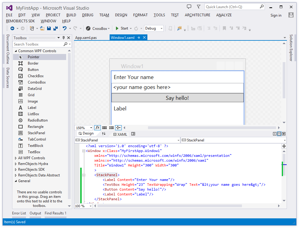
As you can see, the controls automatically stack nicely on top of each other. That's the StackPanel's doing. Essentially, which layout container you pick will determine how your controls get laid out, and the StackPanel stretches each control to full width to build a nice stack.
You can nest different layout containers within each other, so that gives you a lot of flexibility. For example, to show two buttons next to one another, you could drop a horizontal StackPanel into the existing (vertical), and put two buttons into that, and they would lay out both in the same row.
Each control also has – among many other properties – a margin for each side, allowing you to control spacing between controls in any given layout. You can refer to the WPF Documentation on MSDN for more coverage.
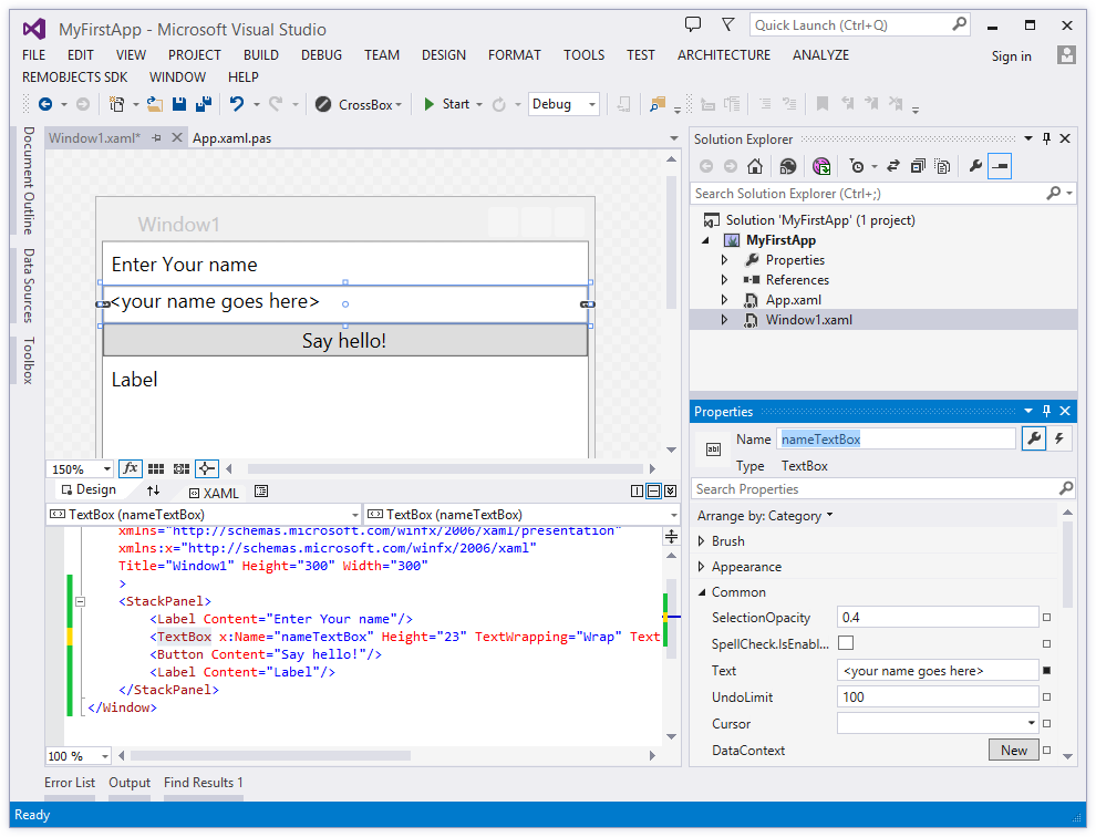
Bring up the "Properties" pane by pressing F4 to modify a control's properties. Here you can, for example, change the Text shown on the labels or the textbox, set margins, or otherwise change the appearance and behavior of the control.
You can also set the "Name" of controls if you want to interact with them from code. Do this by setting the name of the textBox to "nameTextBox" and that of the second Label to "greetingsLabel":
Your XAML should now look like this:
<?xml version='1.0' encoding='utf-8' ?>
<Window x:Class="MyFirstApp.Window1"
xmlns="http://schemas.microsoft.com/winfx/2006/xaml/presentation"
xmlns:x="http://schemas.microsoft.com/winfx/2006/xaml"
Title="Window1" Height="300" Width="300"
>
<StackPanel>
<Label Content="Enter Your name"/>
<TextBox x:Name="nameTextBox" Height="23" TextWrapping="Wrap" Text="<your name goes here>"/>
<Button Content="Say hello!"/>
<Label x:Name="greetingsLabel" Content="Label"/>
</StackPanel>
</Window>
Remember again that you can make any of these changes both in the visual designer and by editing the XAML directly. Wherever you make changes, the other side will sync up after a second. This gives you a lot of power and flexibility to quickly design your UI visually, and then fine-tune it in detail in the XML.
Finally, double-click the Button to create a handler for its Click event. This will take you over to the Window1.* source file and automatically insert a new method into the class for you:
method Window1.Button_Click(sender: System.Object; e: System.Windows.RoutedEventArgs);
begin

end;
private void Button_Click(System.Object sender, System.Windows.RoutedEventArgs e)
{

}
func Button_Click(_ sender: System.Object!, _ e: System.Windows.RoutedEventArgs!) {

}
Your final action is to implement this method to get the name the user entered out of the nameTextBox and write a proper greeting into greetingsLabel:
greetingsLabel.Content := 'hello, '+nameTextBox.Text;
greetingsLabel.Content = "hello, "+nameTextBox.Text;
greetingsLabel.Content = "hello, "+nameTextBox.Text
As you type this code, note how Code Completion already knows about the names of the controls in your XAML file. That's because, as mentioned earlier, a second piece of code is generated from the XAML behind the scenes that becomes part of the same class you are writing in now.
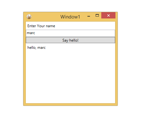
And with that, you should now be ready to run this (very simple) app.
Running Your App
To run your app, just hit the "Start" button with the Play icon, or press F5. Visual Studio will now build your project and launch it: